Planning Blog | Title Design
FONT - The font I will be using will probably be a simple font such as "Helvetica" or "Montserrat". I don't want to use something too techie-looking or fancy since this takes place in a somewhat casual and modern setting.
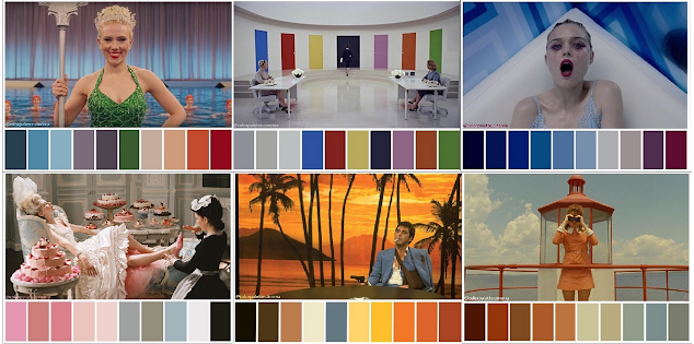
COLOR - I might just do a simple white with some black outline to give contrast and have the titles easily seen. I may or may not end up doing something a little more exciting and less generic, but I'll play around with how it looks as I edit the opening sequence.

TITLE - Since the story is meant to be about jealousy, I was thinking of calling it something like "Green" symbolizing an envious "Green-eyed monster" in folktales. If this ends up being the case, I'll probably add some more green into the titles and story to convey this subtly. I don't want to call it something edgy like "envy" or "vengeance." That sounds pretty corny to me.
Titles may enter and exit the screen to a series of fade-ins and fade-outs. I know this is pretty basic, but I want the opening sequence to be centered around the visuals, I want the titles to be noticeable, but not too flashy with crazy editing that completely distracts you from what's being shown. Another way I could show the titles is by having them in the props and setting, but this seems kind of hard to do.
The titles will stay on screen for a good few seconds, probably around 7 to give the audience enough time to read it while also giving enough time to fit everything.
Comments
Post a Comment