Production | Commercial
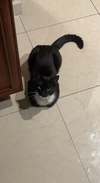
I've been really busy working on my next commercial for the past few days. It's been a bit exhausting, especially since I've had other classwork to juggle, but I've been putting in a lot of effort to gather a variety of pictures that will help me with the filming part of the project. I've collected a bunch of images and video clips that will form the foundation of my advertisement. Most of these clips don't have any sound right now, but I'll be adding sound during the editing process. When I edit, I plan to include voiceovers, music, and more. At the moment, I'm just filming without worrying too much about the sound because I know I can fix that later when I'm editing. By the way, there was a little scare when I accidentally dropped my camera on the kitchen floor while filming a scene. Luckily, it didn't break, but it definitely got me a bit concerned. Next time, I'll just have to be more careful when I film the rest of my project. I've b...

Comments
Post a Comment